Building a Design System
Scalable, quick to update, one shared language
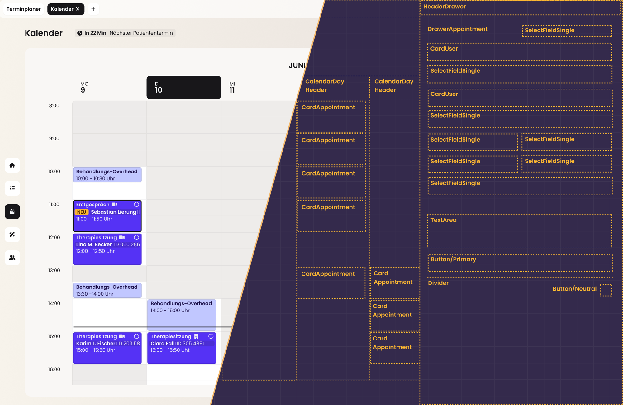
Problem
Our small team was building a complex product and needed a solid design system that would save time and provide consistency.
My role
I set up and maintained most of our components and wrote the guidelines. My design lead and I built the foundation and the visual language together.
Result
A scalable & consistent foundation. A shared language for design and development.
In numbers
- less time per flow update
- 75%
- components
- ~60
Overview
We were moving from a legacy system that no longer met our needs to a new product that we built around how our therapists and staff work. We set up a design system that supports this and future products.
- Team
- 2 UX designers, 1 developer
- Timeline
- Oct 2025 – today, ongoing
- Tools
- Figma, DaisyUI, Stark, Confluence
My part: I focused on building and maintaining our components and wrote the guidelines for naming and component structure. At the start, I also helped lay the foundation. I built our primitive collection and defined a large part of the semantic variables. My design lead and I developed the surface rules together, and we stayed in close exchange with our developer on how the system is built in code.
The problem
Inconsistent design elements and slow updates.
We were a small team working on a complex product. Once the MVP wireframes were done and we moved on to mockups and design specifications, two problems became clear:
Elements drifted apart
Without shared components, the same element slowly drifted apart across screens. We wanted every design element to look and behave the same everywhere, so we could focus on concepts and product decisions instead of checking spacing and colors screen by screen.
Small changes took an hour
With detached components, a 15-minute update could easily turn into an hour, because a single change meant adjusting the same element across dozens of screens. Changes had to be made once and update everywhere.
Goals
Goal 1
Spend our time on concepts and product decisions, not on pushing pixels
Goal 2
Make it obvious which variable to use and how to build new components within the same structure
Goal 3
Use our developer's time where it matters most
Goal 4
Keep the system simple and the UI neutral, with room to grow across years and products
Laying the foundation
Once we understood how DaisyUI and its utility classes work, we built our own primitives and semantics and connected them to DaisyUI.
Components only stay consistent if the values behind them do. So we started with the variables. If every value lives in one place, an update happens once and reaches every screen.
DaisyUI
We compared a Tailwind-based system, building our own from scratch, and DaisyUI. DaisyUI's utility classes connected directly to code, so our developer could focus on details instead of a lengthy setup. Since none of us had built a complex design system before, it gave us a reliable structure to start from.
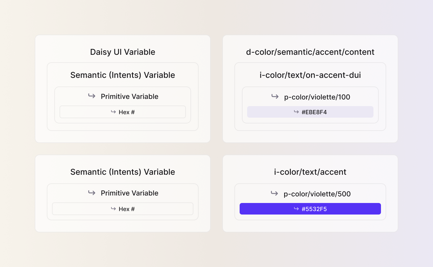
But once we began defining variables, we noticed that DaisyUI handled semantics differently than we needed. Together with our developer, we built a setup in three layers that keeps DaisyUI's speed and still makes the system future-proof.
Primitives: the base layer
I set up our primitive collection, grouped into colors, shades, radii and spacing. Names stay neutral rather than tied to use cases, so meaning can be layered on top later. We defined full value ranges, including ones we don't use yet, to keep the system consistent as it grows.

Nesting our Intents into DaisyUI
On top, we defined semantic variables for color, border width, radius and spacing. Each color token maps to the part of the UI it affects (surface, text, icon or border) and documents its intended use, for example accent text versus text on an accent background. Since DaisyUI already uses the term "semantic", we named our collection Intents.

In one of our alignment meetings, we came up with nesting our Intents into the DaisyUI collection. This kept the clarity of our own semantics while preserving DaisyUI's existing structure. We now work with two collections:
- DaisyUI (
d-): used wherever possible - Intents (
i-): everything we need on top
Intents that feed into DaisyUI carry a -dui suffix, so it's always clear what is connected where.

Our color palette
We wanted our designs to stay neutral, so that accents carry clear meaning and importance. That's why we started with a minimal color palette that can be extended whenever needed. Every color has shades from 100 to 900, and I made sure that all text and background pairings pass the contrast check.

A simple visual language
A complex product doesn't need a complex visual language. With usability and functionality as our focus, we reduced the UI to a few surface and interaction types. Repeated across the whole product, they keep it consistent and reduce cognitive load.
Glass surfaces for layered content
Our product relies heavily on progressive disclosure, so content often sits in several layers. My design lead and I developed translucent surfaces that make these layers visible on any background without hurting readability. They also let us reuse the same interaction patterns everywhere, without adjusting their colors to each background. We checked the contrasts and refined the raised and inverted states.

Same interaction, same states
Components with the same type of interaction also share the same states, whether you type into a field or select an option. Users learn each pattern once and recognize it everywhere, which reduces cognitive load.
Input fields have a solid white fill only when they are interactive. Fields that can't be edited have no fill, so it's immediately clear what users can change. Hover, active and mandatory states show through the border color alone.

Selection elements usually sit on a raised white surface and therefore use an indented fill. The exceptions are elements without a raised surface beneath them, such as the main menu or the tab menu, where the active tab stays light to connect with its attached card. Across all of them, reversed colors follow the same pattern and make every state clear at a glance.

Building the components
Most of my work went into the components. I set up most of our ~60 components and keep them up to date as the product grows. Wherever possible, I used properties instead of new variants. This keeps each component as small as possible, easy to change and simple to use for designers and developers.
Every component also has a text property, so the text stays when you switch variants. Changing an accent button to a primary one no longer means typing the label in again. Across many screens, this saves a lot of small, tedious steps.
Tab and TabBar
I built the tab with its two uses in mind, the tab bar and the tab menu, and adjusted it as those took shape. The leading icon and the trailing element can be switched on and off independently, so one component covers every combination and all of them stay aligned. The active state follows the tab bar it sits in, so indented and raised bars each got their own.

User card
User cards show a patient or a therapist. In many places, such as the appointment drawer, they work like buttons and lead to the patient record or the therapist's page. Before I built the card, my design lead and I worked out together where it would appear, what it needed to show and which states it needed.
Some flows need to add or remove a person, but the card itself is never edited. So we decided to move this into the select field instead of building a more complex card. While editing, people appear there as chips that echo the card's layout. Once you leave edit mode, they turn back into user cards that inform and navigate. That is also why the card has no fill by default, unlike our select fields. A light fill only appears on hover. I built all optional parts as properties, so the card stays one component.

Badges
Badges use our status colors. Designers first pick the status and then the type, so the color always carries meaning and never becomes a matter of taste. Soft or dark depends on the background and on how much weight the badge needs.

Working with the system
Guidelines
To keep the system consistent as it grows, I wrote short guidelines on naming and on when to create a variant versus a new component. This way, anyone on the team can extend the system. AI helped me draft and refine them faster.

Handoff & collaboration
We built the system in close contact with development, which made the work easier and more effective for everyone.
Early on, we agreed with our developer on how he would get design specs. Figma Dev Mode covered his needs, so we annotated our designs for it. In regular design reviews, we compared the build with our designs and tracked differences in a shared Confluence table. Ongoing alignment meetings kept us in sync. We knew what was technically possible, and he knew where we were heading.
Changes now happen once and reach every screen
Goal 1: Spend our time on concepts, not on pushing pixels
We now build concepts from a kit of real components, so spacing and sizes look exactly as they will in the product. Updating a flow used to mean adjusting every screen by hand. Now we change the component once and every screen follows. That takes about 75% less time.
Goal 2: Make it obvious which variable to use
Each variable has a clear name and a short description of where to use it.
Goal 3: Use our developer's time where it matters most
No lengthy setup, and specs come straight from Dev Mode.
Goal 4: Keep it simple and neutral, with room to grow
We use the system every day and keep developing it. It covers what we need today without limiting what comes next.
Learnings
Sometimes starting from scratch is faster
DaisyUI gave us structure and a quick start at a time when none of us had built a design system before. But its fixed setup also set limits that cost us time early on. Knowing what I know now, I would consider starting from scratch and make the system exactly as simple or complex as it needs to be.
It's less complicated than it seems
Setting up our variables only clicked once we talked to our developer and saw how they look on his side and what he needs from us. The same was true for components. Once I understood when to use a property, when a variant and when a new component makes sense, building new ones became much easier. With the basics clear, a design system suddenly stops looking complicated.
Detaching is fine, until it reaches the specs
Detaching components helps us explore ideas quickly, and we still do it often. But when I updated our appointment drawer, one section stayed the same. It had been detached during concept work and copied into the design specs that way. Finding it meant checking a whole flow by hand. Since then, we make sure that everything in our design specs is a real component again.
Close exchange makes implementation easier
Our handoff worked because we agreed early on what our developer needed and kept checking in. With AI changing how designs get built, I don't expect that setup to stay the same for long. The format of documentation will change, but I think the close exchange between design and development is what will stay.